
THE BRIEF
Cirrus is an IT support company offering services in cloud management, tech support, and phone systems. They came to me looking for a full rebrand, with a new identity that felt clean and modern but still approachable and friendly.
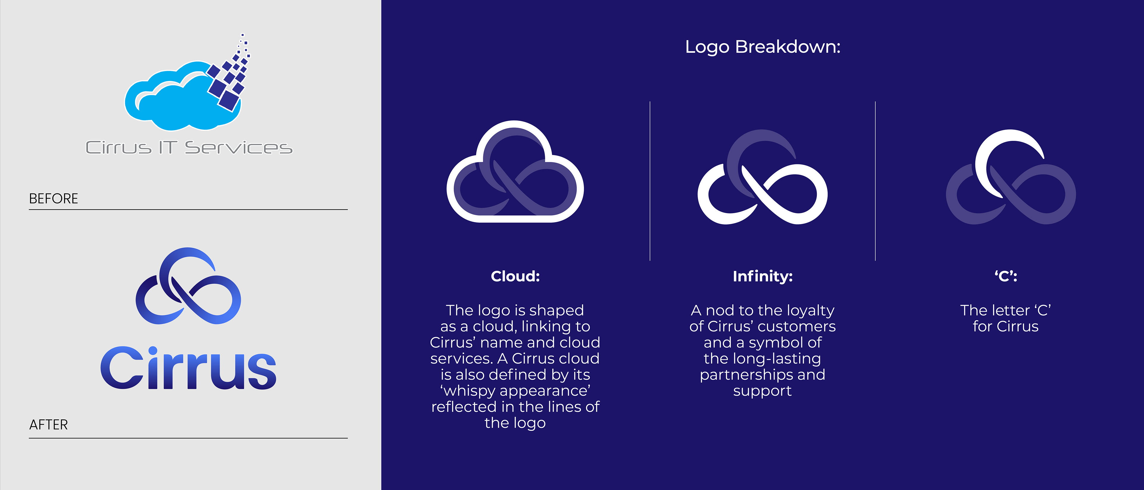
After spending some time on strategy and getting aligned, we highlighted that one of Cirrus’ core strengths is loyalty. Their customers come back again and again, so it felt important to reflect that in the branding.
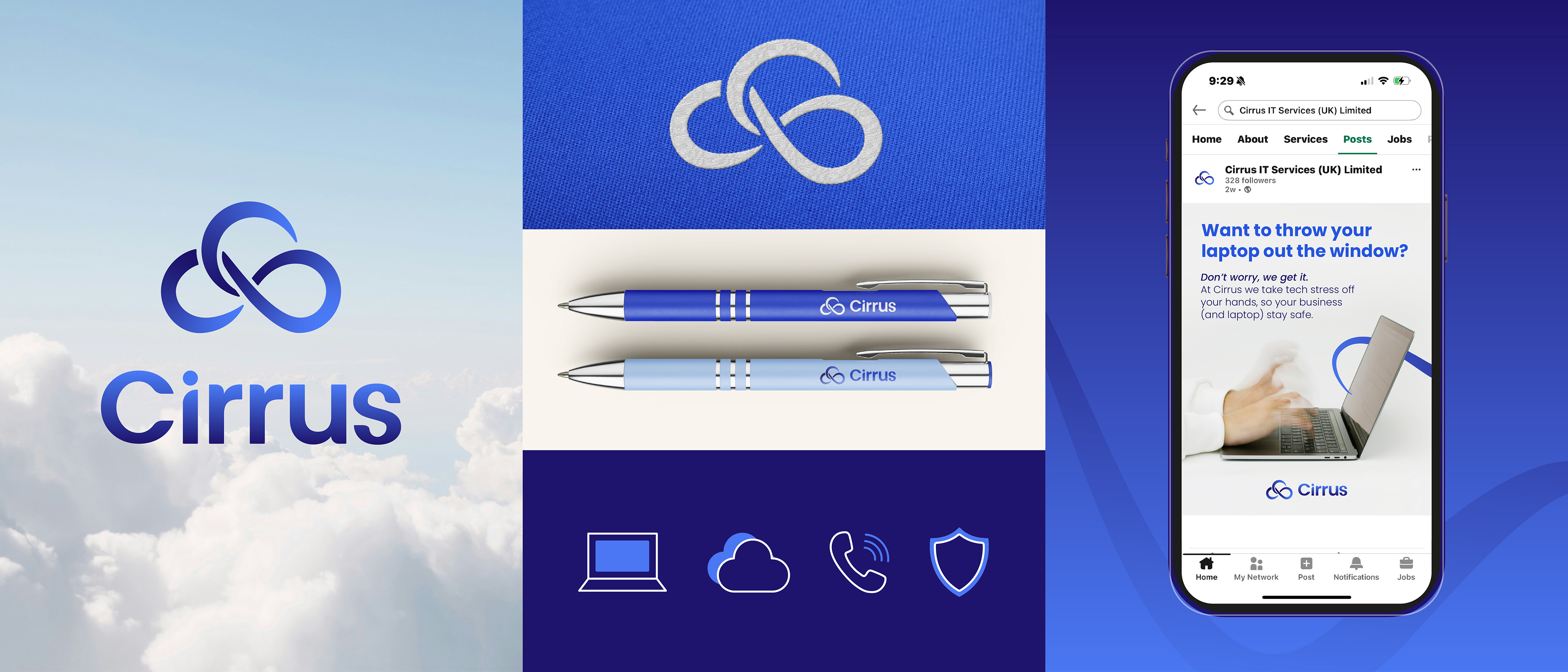
We also explored the name itself, Cirrus is a type of cloud, which ties nicely into their cloud management services. It made sense to include a cloud reference in the logo, not only to reinforce what they do but also as a nod to their previous identity.
THE SOLUTION
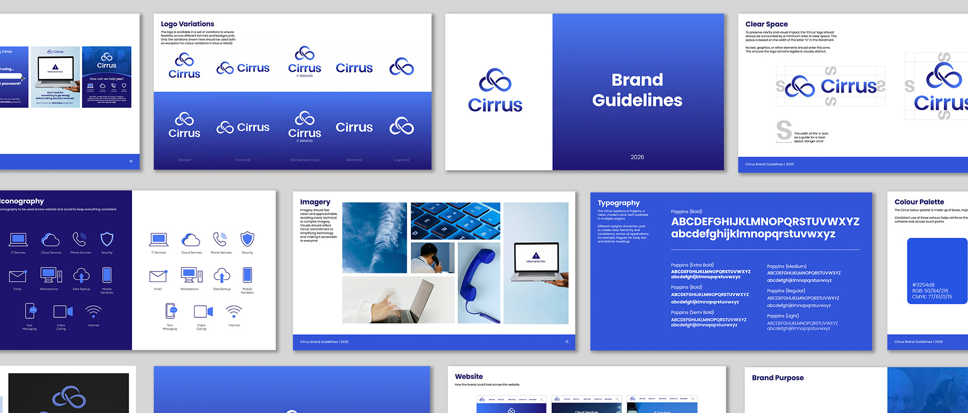
After agreeing on a route, I created extensive brand guidelines containing strategy from brand positioning to tone of voice and visual identity including logo variations, typography, colours, iconography, social media, email banners and web design allowing the client to move forward with confidence and clarity behind their refreshed brand.
Client Feedback:
"Carina was exceptional from start to finish. She took the time to truly understand our business, so when we moved through the structured design stages, she instinctively knew what we needed and brought it to life, no lengthy briefings required. It felt less like working with an external contractor and more like having an internal team member alongside us. The feedback from our customers and suppliers on our new brand has been 100% positive, and we wouldn't hesitate to recommend her."
-Scott Magee, CEO
Receiving feedback like this is why I love what I do. I really care about producing high quality, strategy led work which also looks beautiful. If you are interested in working with me, get in touch below...